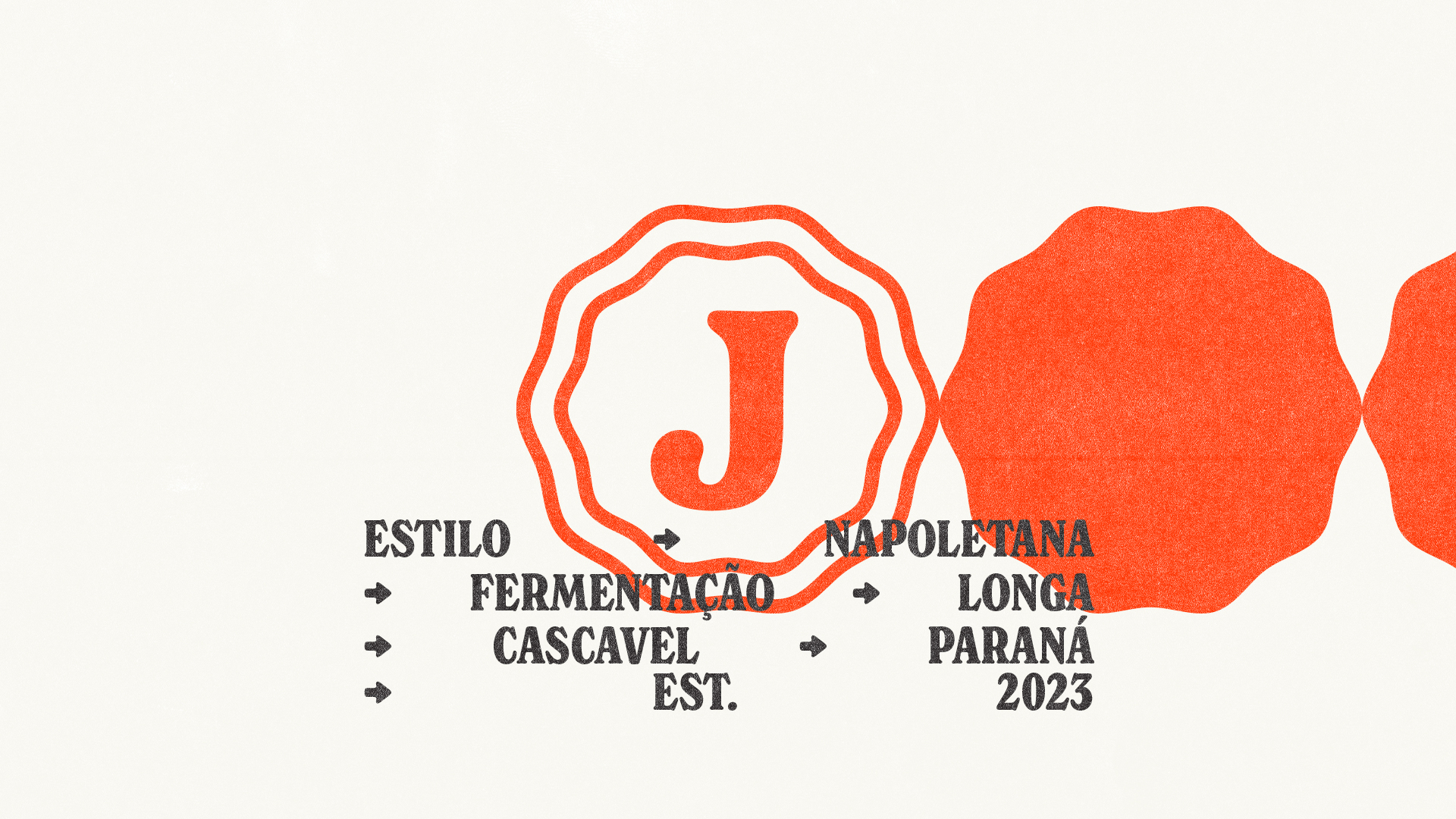
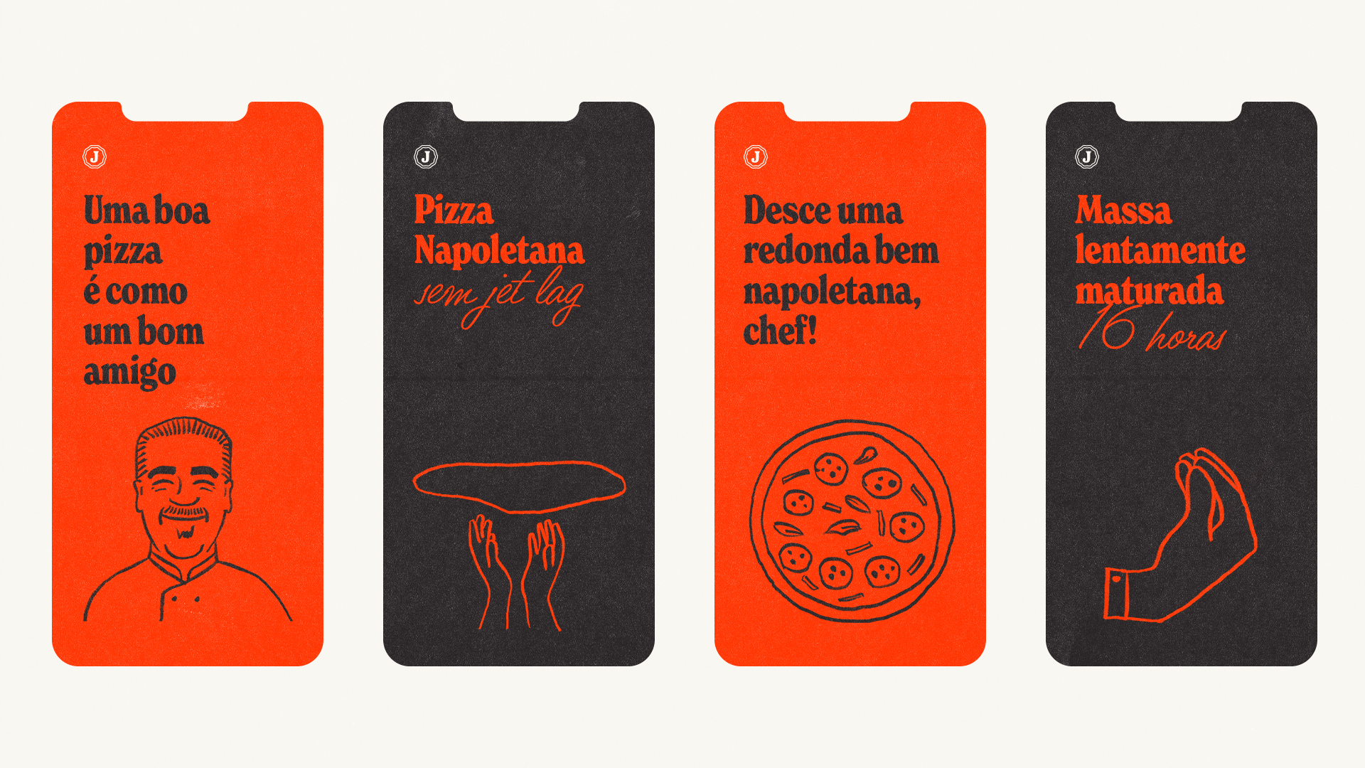
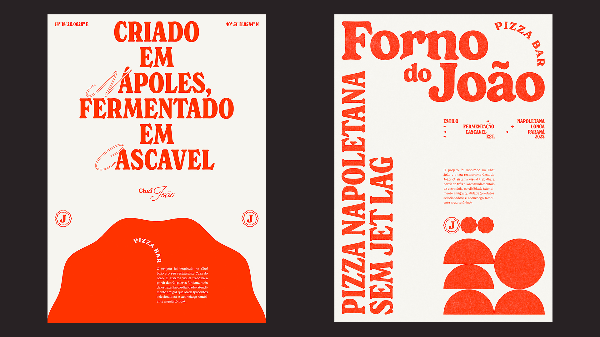
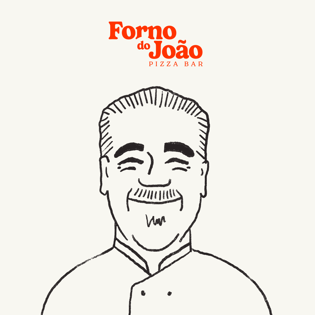
The project was inspired by Chef João and his restaurant Casa do João. The visual system is based on three fundamental pillars of the strategy: friendliness (friendly service), quality (selected products), and coziness (architectural environment).
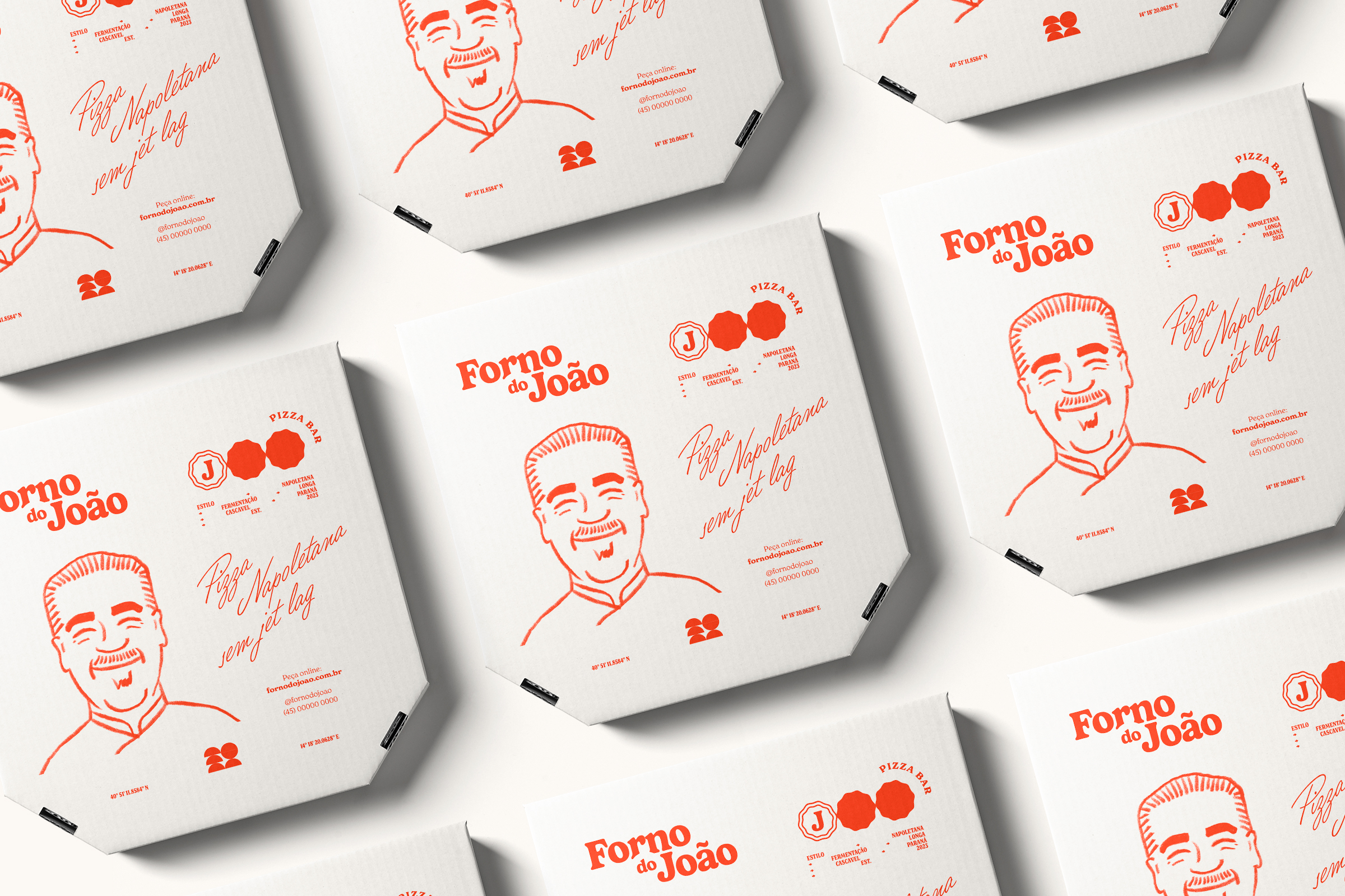
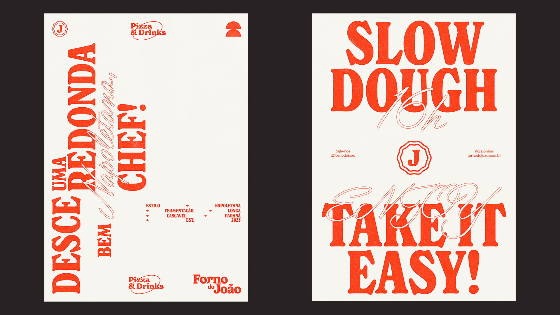
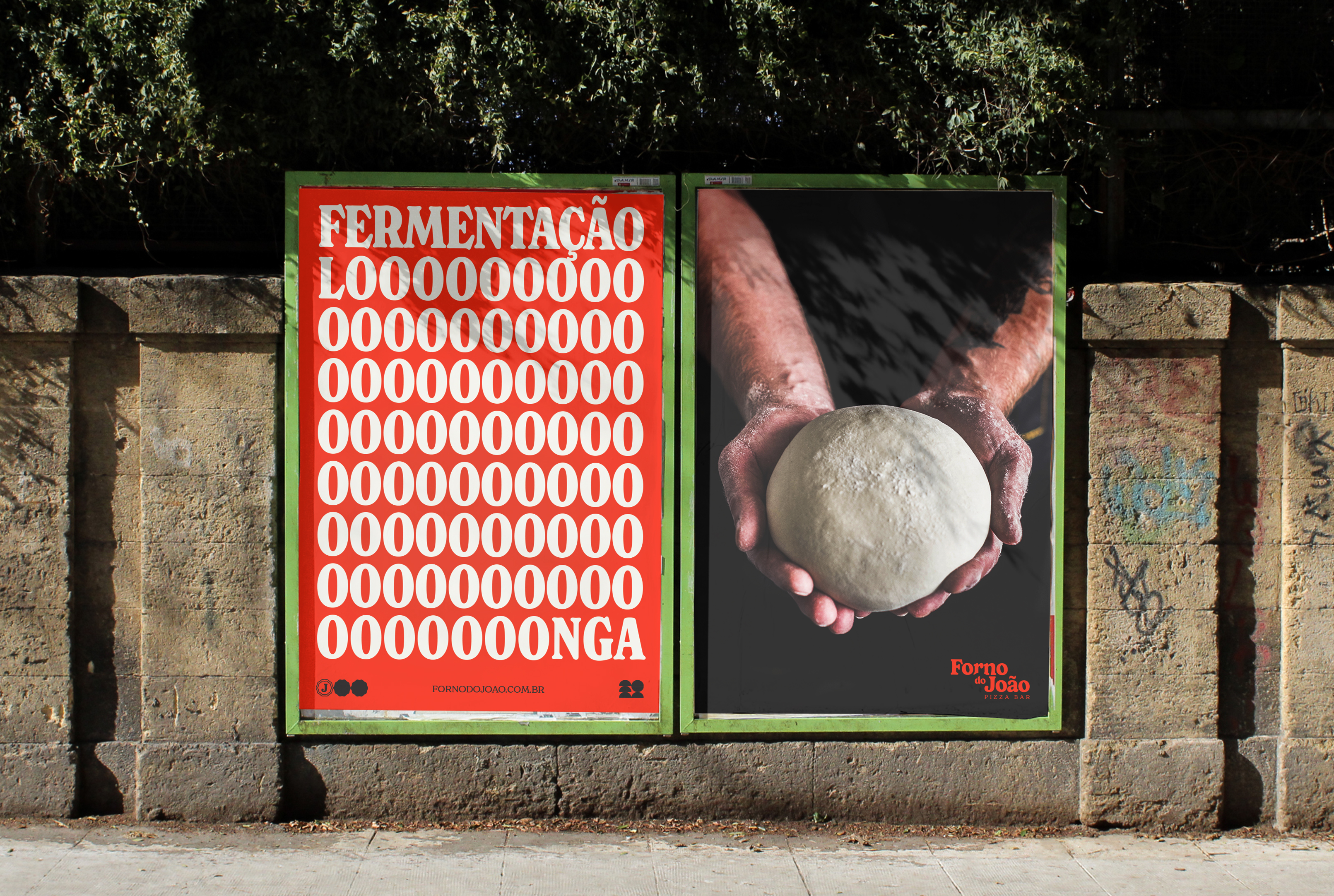
The slab font carries a friendly feeling, and together with the color palette that references tomato sauce, it makes for a cozy and friendly brand.
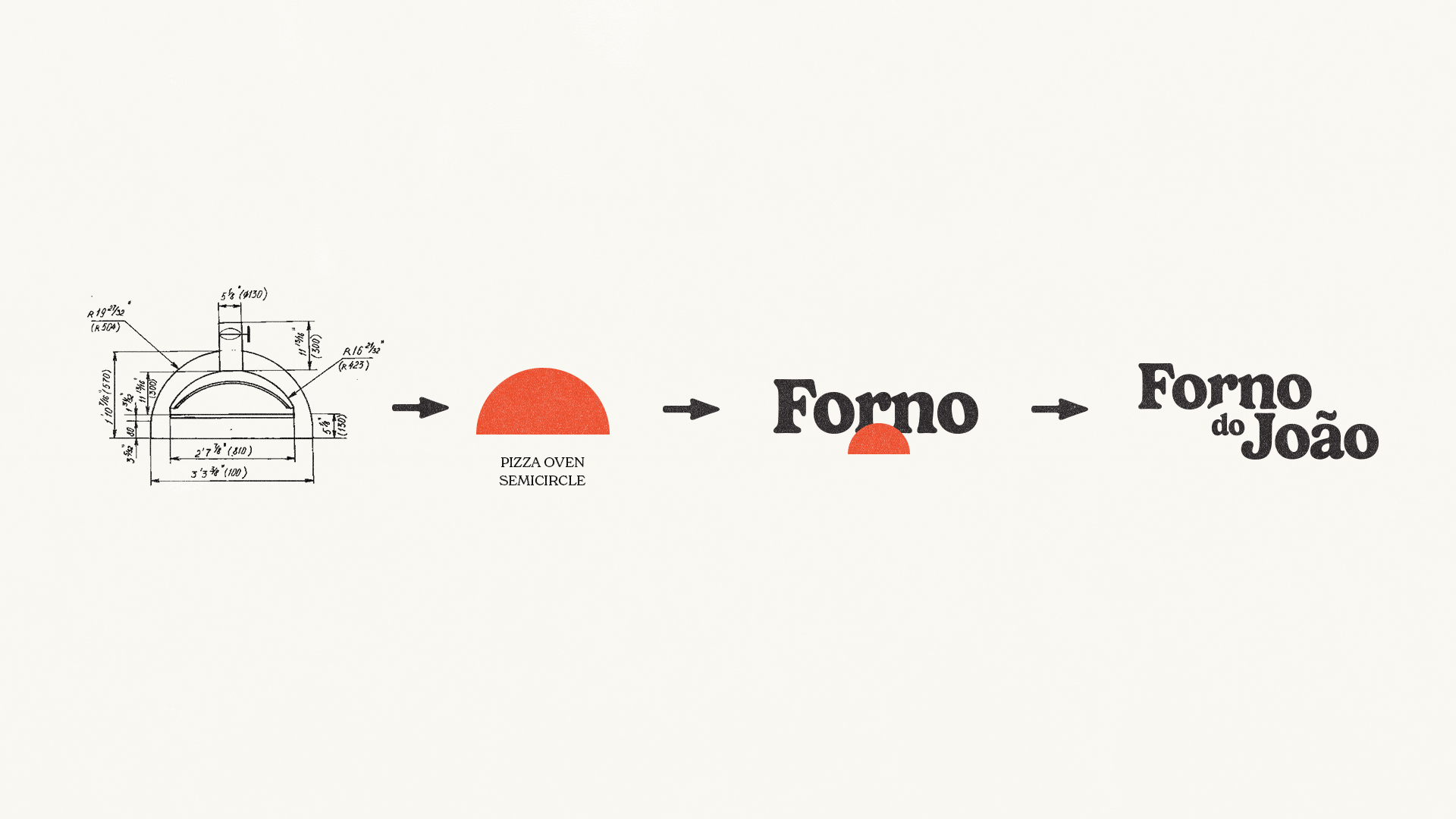
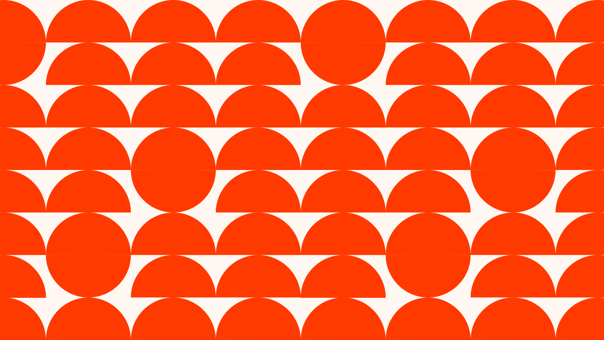
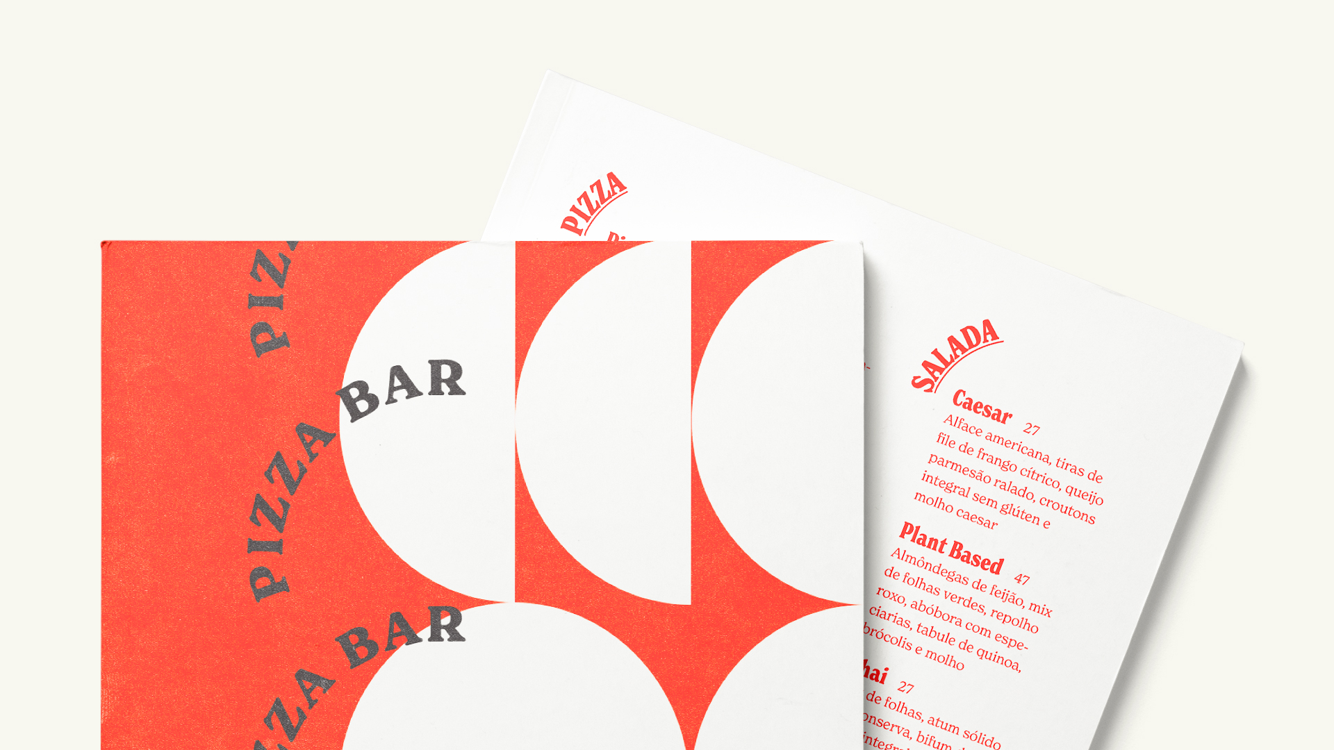
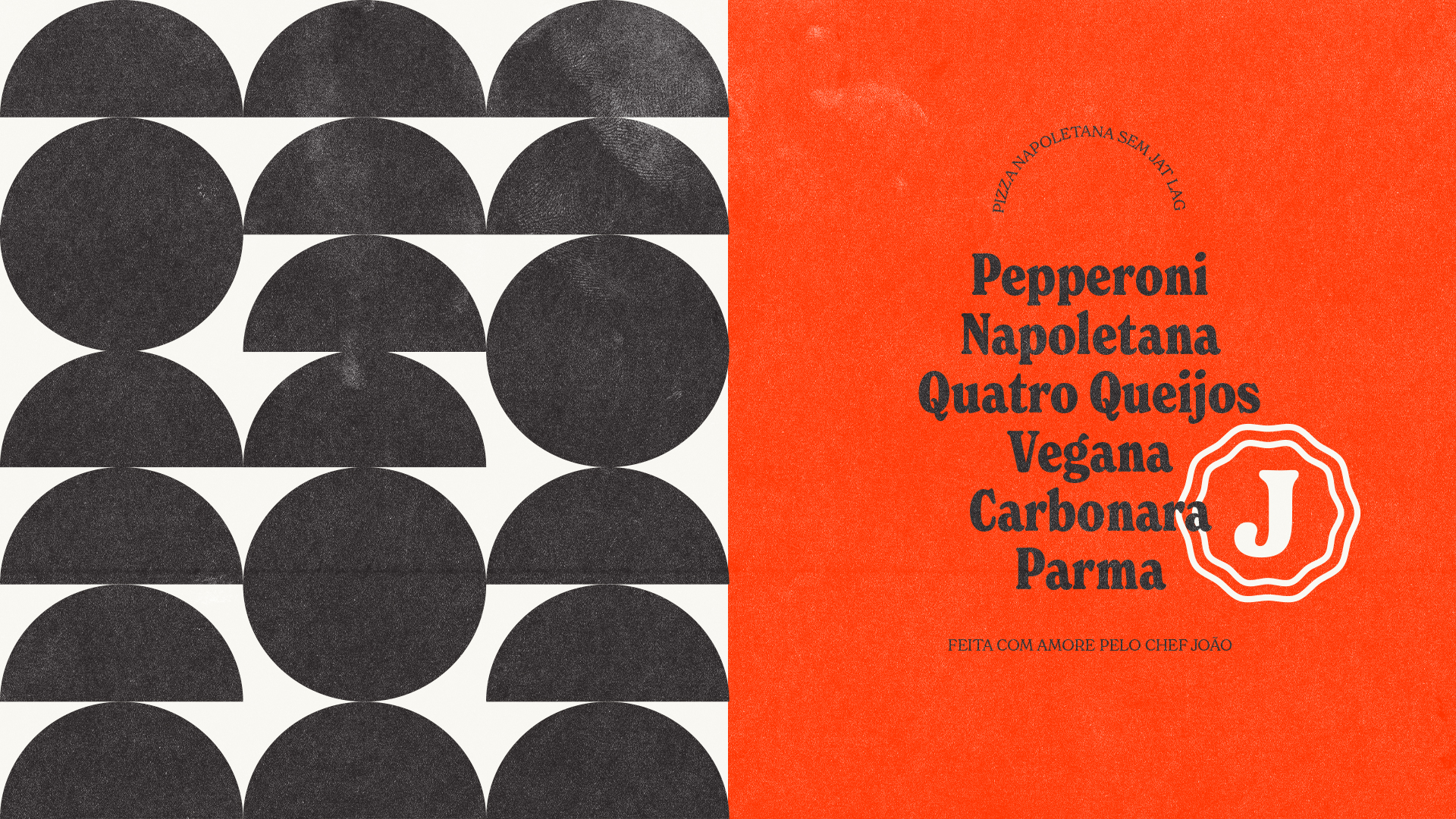
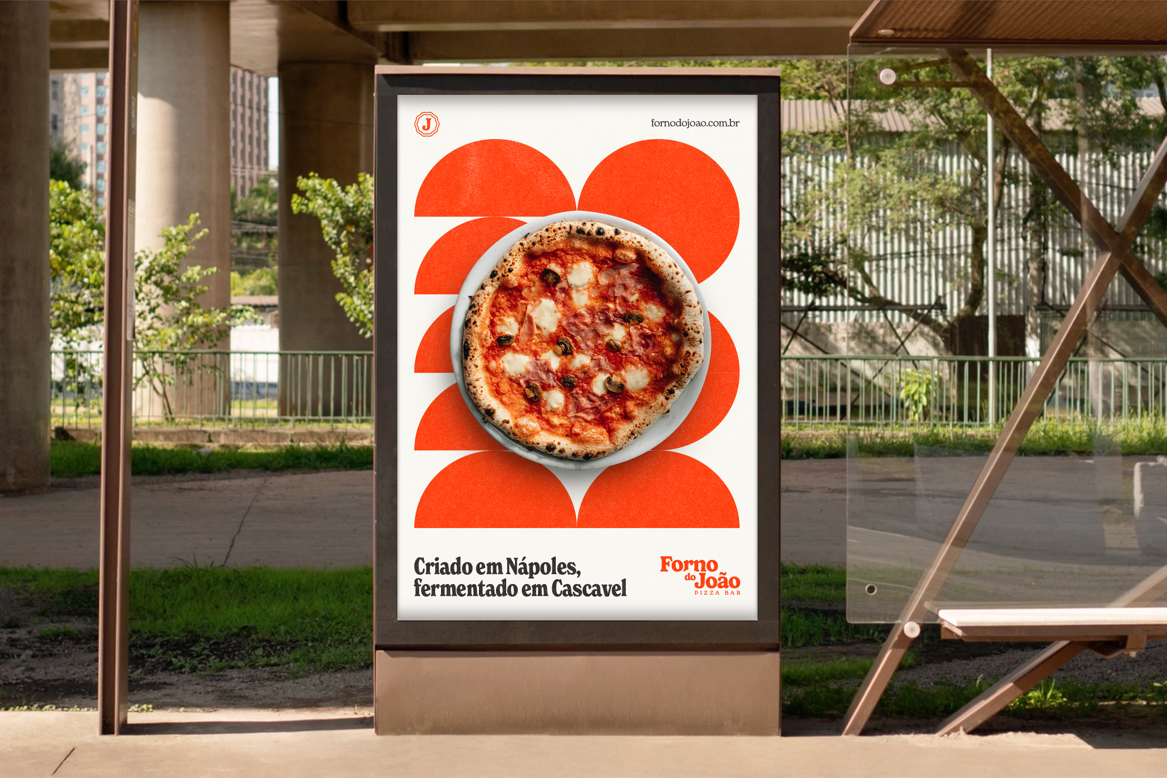
The geometric shapes are inspired by the shape of pizzas and the oven where they are baked.
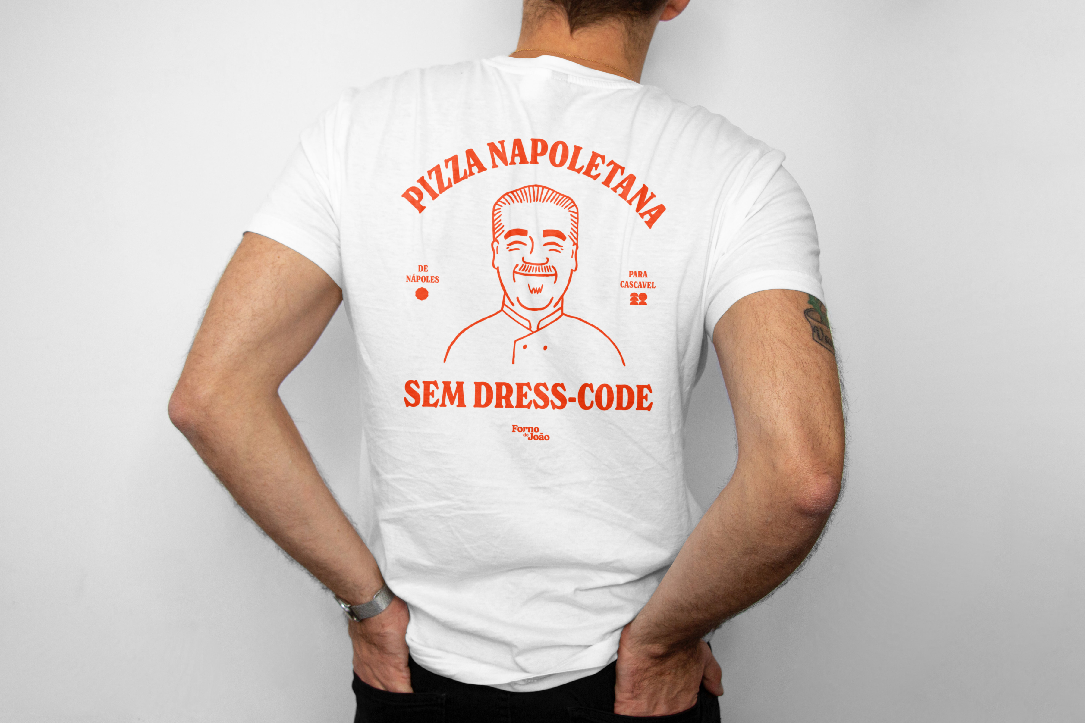
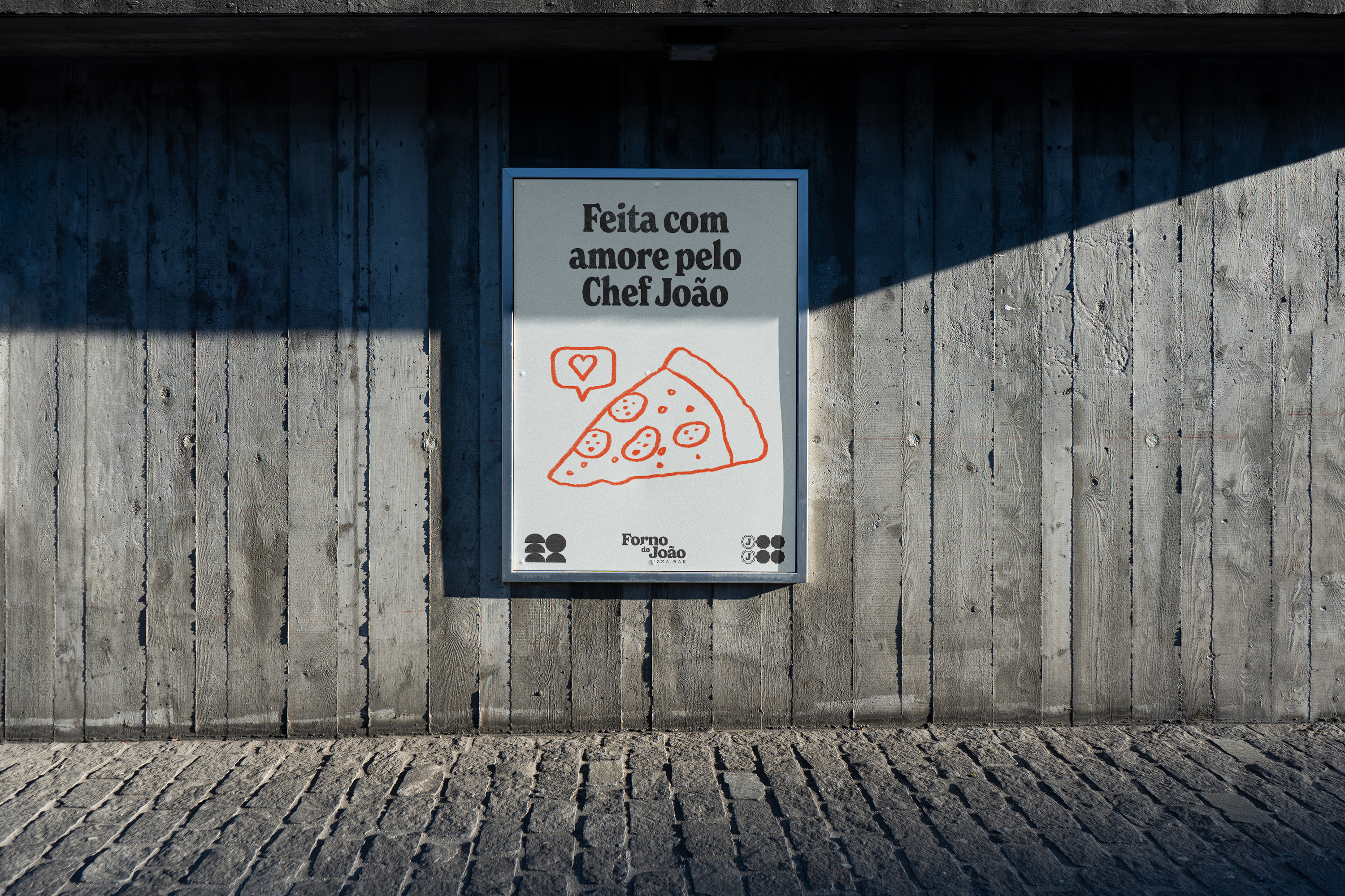
The illustration helps affirm the coziness and friendliness that Chef João, and now his new brand Forno do João, naturally exude in their lives.
Bring on a nice Neapolitan pizza, chef!
The slab font carries a friendly feeling, and together with the color palette that references tomato sauce, it makes for a cozy and friendly brand.
The geometric shapes are inspired by the shape of pizzas and the oven where they are baked.
The illustration helps affirm the coziness and friendliness that Chef João, and now his new brand Forno do João, naturally exude in their lives.
Bring on a nice Neapolitan pizza, chef!
Role:
Strategy, Copy, Graphic Design
Freelancer 2023
Strategy, Copy, Graphic Design
Freelancer 2023